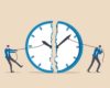
How to Use a Conversion Funnel to Improve User Experience
Having a carefully crafted conversion funnel is crucial for your audiences’ user experience.
With the right funnel elements in place, your would-be customers would have a seamless journey from being just website visitors, into becoming paying customers.
With a confusing funnel, however, your would-be customers would go in loops, all while getting confused about where and what they’re supposed to do — this ultimately leads to them clicking away or unsubscribing to your newsletters.
If you’re struggling with giving your audience a better user experience, allow me to share with you in this guide how your conversion funnels can help you with just that.
Let’s hop right in.
1. Ensure Your Ads Lead Directly to a Designated Product Page.
Some business owners make the mistake of running paid ads while pointing their ads’ link to their homepage.
While there is certainly a time and a place for that, for the most part, you should be pointing your ads directly to your product pages or your offer page.
Take dropshippers, for example.
It’s common practice for dropshipping store owners to run a Facebook ad to promote their products, all while pointing the ad directly to their product page.
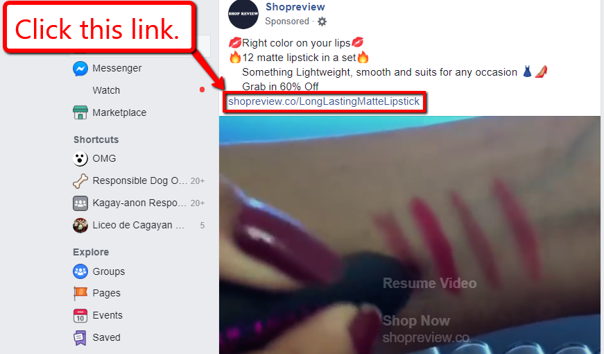
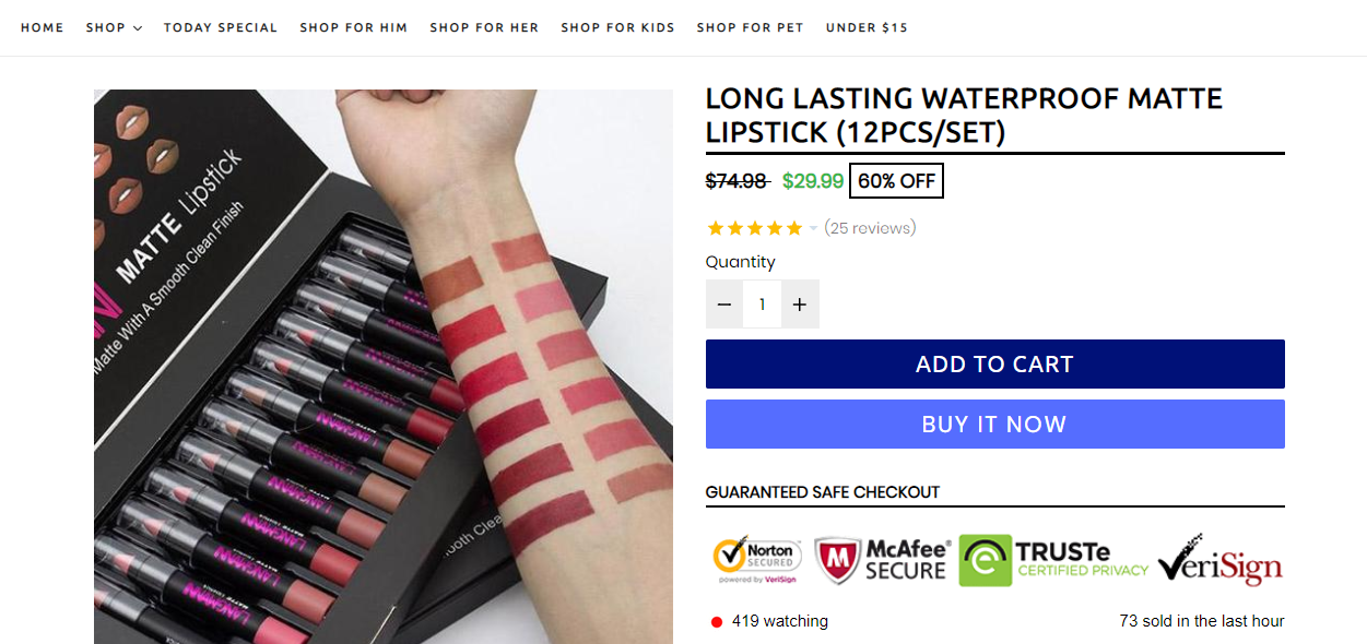
This ensures that their audience immediately gets what they’re looking for after clicking their ad. This tip is tried and tested to be effective that most comprehensive dropshipping guides even support it.
Rarely will you find dropshippers run a paid ad and point it to their homepage.
Think about it, if your ad creative talks about a specific product that offers a specific solution, then your customer would expect to be routed to the actual product when they click the link in your paid ad.
If you point the link to your homepage, however, they’ll just be confused as to why you brought them there.
By confusing them, you’d have already ruined their customer experience.
Your audience clicks on your link to satisfy their needs — for products, services, information, etc. — and you can get better conversions by answering that need directly.
2. Offer Easy-to-Use Opt-in Forms
If not enough people are signing up to your email list, then you need to check the opt-in forms you are using.
Does it look professional?
If it’s a pop-up, is it timed just right?
Also, are you asking too much information?
Your opt-in forms are meant to help you generate leads. If you don’t use them properly, they will only be a nuisance to your audience, therefore, ruining their experience on your website.
To ensure, to some extent, that your opt-in forms are bringing you good (and not harm), here are some tips on how you should create your forms:
- Don’t ask for too much information. Keep your forms simple and straightforward. Don’t ask for user information that you don’t really need and only ask for necessary details such as their name and email address.
- Make your CTA button stand out. Instead of using common phrases like “Subscribe,” use “Send me your newsletter” or “Get free ebook” to entice them to sign up.
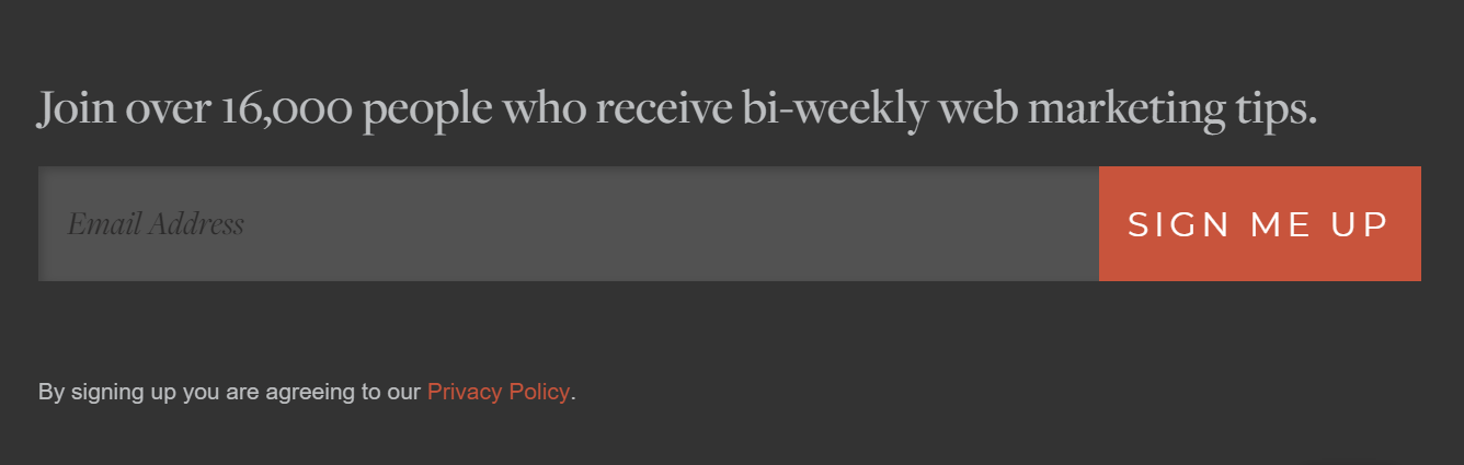
- Use sign-up forms instead of links. If your sign-up prompts are on your footer, navigation bar, header, or anywhere else on your website, use embedded forms instead of links to make them easier to spot and for users to fill out.
Use something like this:
d. Find the perfect timing for your pop-ups. Timing is crucial for your pop-ups to be effective. If they’re too early, they might end up annoying your site visitors.
If they’re too late, you might miss the sign-up opportunity if your visitors leave your site without seeing the prompt.
You can also split test elements such as the number of form fields, pop-up timing, call-to-action button, where your form is placed, etc., to see what works best for your audiences.
By doing so, you will know what form elements you need to improve to give better user experience that will ultimately get them to subscribe.
3. Optimize Web Design Elements For Easier Navigation
The best user experiences allow for interactions that require minimum effort but will give maximum gains.
Keep in mind that no matter how beautiful your site looks or how much high-quality content it has, if your users can’t navigate your site and find the content that they need, they’ll click away in a matter of seconds.
So how can you ensure that your website has the usability and functionality that will also help in getting your site visitors to convert into buyers?
The solution: Optimize your web design elements to help improve user navigation.
It may be best to entrust this to a user experience design agency, but in general, here are the aspects that should be focused on.
a. Keep your navigation bar simple.
Avoid making your navigation bar labels too long — so you don’t overwhelm users.
Your navigation bar should give your users clear choices of the web pages they want to visit.
For example, if your website is about cryptocurrency, you can use a navigation dropdown that includes resources on cryptocurrency trading. This makes finding related information easier for users.
Also, keep the items on your navigation bar to a minimum (around five to seven) if possible so as not to overcrowd it. Otherwise, your users might just be overwhelmed by it.
b. Make your CTA button stand out.
Catch your users’ attention by being more creative with the color, size, and even how your call-to-action button is written.
Keep user flow in mind to determine how to strategically place your CTA button and allow users to go through a straightforward process to achieve consumers and your goal.
For example, design your landing page in a way that will ensure users can find your “Subscribe” or “Submit your Startup” button after reading the information about your offer. By doing so, they will understand what they are subscribing to and whether or not they need it.
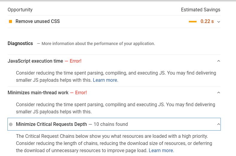
c. Optimize your page load speed.
Your website’s load speed can make or break your users’ experience on our website.
Regardless of how optimized your web elements are for better conversions, if your website doesn’t load within 3 seconds, 40% of users will click on the close button and look somewhere else.
Yikes! 40% is almost half of the potential customers you won’t want to miss out on.
So to help prevent that from happening, you need to check on your site’s load speed using tools like Google’s PageSpeed Insights.
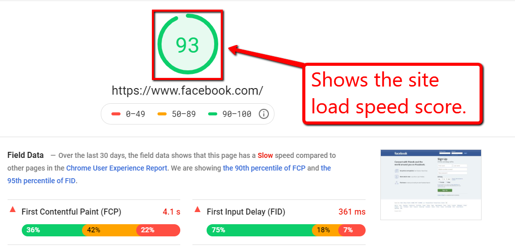
The tool also provides you with specific recommendations to help optimize your website’s performance.
These are just some of the web design elements that you can optimize for better user experience and help increase your conversions.
Keep in mind that users visit your website because they have needs.
Catering to your users’ needs and providing them the ease and efficiency of going through your site is added value to what you are offering.
Give users an experience that allows for easy navigation by optimizing the web elements to guide your site visitors on your website and act on your conversion goal.
4. Simplify Checkout Process
People want straightforward and quick ways to achieve their goal of visiting your website.
So you can capitalize their tendencies which gravitates towards instant gratification, you need to ensure that your checkout page doesn’t burden users with non-essential information and web elements.
Keep these tips in mind to help simplify your checkout process:
- Request only necessary information. Label your checkout forms clearly and ask only for vital user information to continue the transaction. If you need to ask for additional details, give a short explanation as to why you’re asking for them.
- Offer different checkout options. Give your site users the option to purchase as a member, guest user, or even create an account with your website.
This way, your users who are not ready to sign up as members (yet) can still buy your products, and members can have the ease of quick checkouts by having their payment details stored on your site.
- Add a progress indicator. This lets your users know what stage they’re at in the checkout process and what steps are left to complete their purchase.
- Allow customers to modify orders. Users can make mistakes, such as the wrong product color or the wrong size, or miss filling out details on the forms.
Make order modification easier before users can finalize their orders, and have pop-up messages or highlight incorrect fields so users can spot them immediately.
Finally, do a split test of your web elements and pages to know which ones generate better conversions.
This way, you’ll also know what to improve and optimize to help improve your users’ experience with your website.
What’s Next?
What strategies or methodologies have you been using to fine-tune your conversion funnels to help improve your would-be customers’ user experience?
If you have tricks up your sleeve that you’d like to share with the audience, feel free to share them in the comments section below. Cheers!