5 Key Design Tips For High Converting Landing Pages
Landing pages are an invaluable part of any online marketing campaign. You can use them for everything from acquiring data about visitors to your site to lead generation. A great landing page should do more than just generate interest, though. It should convert that interest into action. Here, we’re going to explore how you can make high-converting landing pages that work for your business:
What You’ll Learn
- The importance of consistency throughout your marketing to landing page conversion
- How your landing page’s layout can affect conversion rates
- How to create engaging call-to-actions
- The importance of mobile-friendly landing pages
- How to test your landing pages to get the best results
Tip 1: Consistency is Key
This tip is kind of Design 101 (that’s the reason it’s the first tip), but it’s an essential element of any high converting landing page – it’s worth emphasizing. Brand consistency is key to establishing your company in the minds of consumers; there’s a reason McDonald’s burgers taste the same all around the world.
You know your brand’s identity; hopefully, you’ve developed brand guidelines to maintain consistency throughout your media. When a potential client clicks on a PPC advertisement, a social media post, or an optimized link, the landing page they end up on shouldn’t deviate from what they saw before they clicked.
An example is appropriate here: imagine you have an advertisement that’s all in red and blue, with a lot of geometrical elements. You click on the ad and you’re transported to a page in green and yellow using a lot of curvy lines and different font. You’ll wonder whether or not you clicked on the wrong ad!
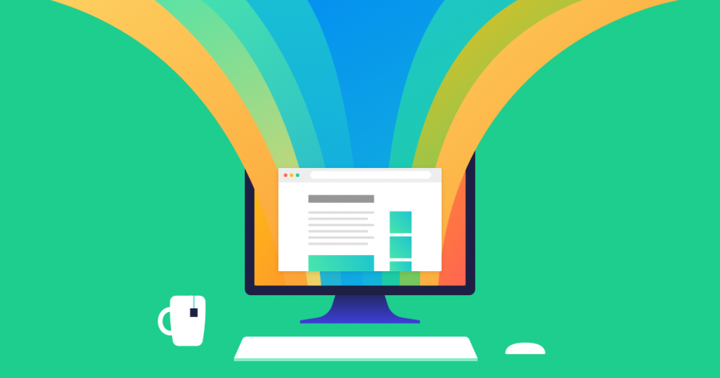
Tip 2: Laying It All Out
Formatting on your landing page should be ultra-efficient; a logo at the top, a large piece of text, image, or video that acts as an elevator pitch for your product or service, and a form with a call-to-action. Keep it simple and give your clients what they’re looking for: information and the ability to act.
Your form should be extremely short; we’ll talk about this more in the section discussing designing for mobile, but the truth is that no one wants to fill out a large form. Use contrasting colours in order to distinguish your call-to-action from the rest of the landing page (more on that in the call-to-action section).
When laying out a page, information hierarchy is one of the most important things to consider. When you’ve created your landing page, get a number of people to look at it and ask them to order what catches their eye, first, second, and third. Those three places should be occupied by your logo, the information you want your clients to know, and the form you want them to fill out.
Tip 3: Lights, Camera, Call-To-Action
Your call-to-action is one of the most important elements of your landing page; in some sense, it’s what the landing page is all about! That means you should pay special attention to it when constructing your landing page. Users eyes should gravitate towards the call-to-action, and when they see it, they should want to click it.
How exactly you’ll design your call-to-action to accomplish this will depend largely on the type of business you run. We’ve already discussed how the call-to-action should be a different colour to create contrast. This is especially useful if you have multiple call-to-actions on a page and you want users to pick a particular one. You might also try using bold font in your call-to-action or making it a bit larger than other buttons on the page.
You’ll want to consider the copy in your call-to-action, too, and that’s where awareness of the demographics interested in your brand will come in handy. When you’re running an accounting company, a call-to-action as simple as “Book Now” might serve well if you have a more conservative client base. Then again, an accountant hoping to work with creatives might go with “Start Saving Money!”; the more playful call could be better for their client base.
Pinnacle Painting, a Canadian painting company, recently changed their call-to-actions to reflect this advice. Even on their homepage you can see contrasting colours and bold font in their buttons, and their landing pages have a similar design. This has lead to an increase in traffic and a lead conversion rate of 17%.
Tip 4: Stay Mobile
You press an ad on your phone and you’re taken to a page that loads slowly, with massive, disorienting graphics. You, for some reason, decide to stay on this page, and after scrolling through a badly formatted mess, you find a 10 field form that you need to fill out. You hadn’t left the page before, but that was the last straw – you’re out of there!
About half of all traffic on the Internet is on mobile devices so your landing pages need to be optimized for mobile or you’re missing out on half your potential client base. This can be as simple as designing responsively, limiting the number of fields you need to fill in on a form (get it down to one, if you can), and using best practices to reduce mobile loading times.
Tip 5: Stay Curious
One of the most exciting things about landing pages is the amount of data you can get from them. You can, for example, create one landing page with elements oriented to the left, and another with elements oriented to the right.
You’ll still get the same data from these landing pages – who clicked them, how they accessed them, how long they stayed on the page, whether or not they clicked the call-to-action, etc. You can then compare how effective the landing page with the elements oriented to the left were to the page with the elements oriented right. This is known as A/B testing.
You can run more than two different landing pages, of course, and you can vary more than one different element on these pages; this is known as multivariate testing.
Using all of this information, you can deduce which types of landing pages and call-to-actions are most effective at getting certain segments of your potential client base to respond the way you want them to. Your capacity to do this will, of course, depend on your resources. When you’re marketing on a budget, you might opt to simply use one or two different landing pages.