6 Tips for Showcasing Your Products on Your Homepage
When it comes to e-commerce, a well-designed website can make the difference between a bounce and a sale. And if you’re after the latter, it’s safe to say that you’ll want to showcase your products on your homepage.
But, this can be a tricky feat. As most websites nowadays gravitate towards simple designs, introducing too many new elements can disturb your overall aesthetics, which could, in turn, negatively reflect on your conversions. Furthermore, adding too many things to your homepage can draw attention from the things you’d like to point out, such as reviews, buyer protection, or loyalty programs.
Does this mean that you shouldn’t include products (and Add to cart buttons) right on your homepage? Absolutely not!
But, it does mean that you should stick to a few ground rules so as not to hurt your chances of doing what you ultimately want to do – make sales.
Tip #1: Keep things simple
You don’t have to go with a completely minimalist design. However, do try to keep your website simple enough so that your visitors can focus on a single thing at a time.
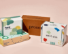
When adding products to your homepage, make sure that they’re clearly separated from the rest of the page’s elements. Add a heading, include plenty of white space, and don’t feature too many products. Three or four are more than enough, while you can add a See All button, as in the case of Felix Gray.
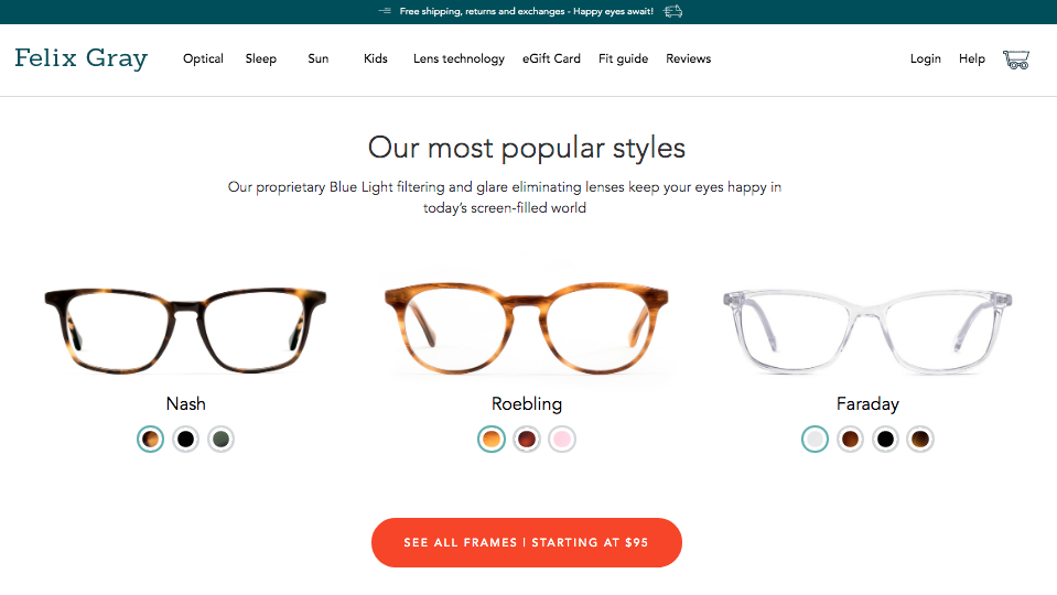
The brand’s approach is simplistic, effective, and gives a preview, without creating too much clutter on the homepage. The extra space is then used to show off social proof, unique features, and benefits that buyers enjoy when shopping with the brand.
Tip #2: Don’t be afraid to go into detail
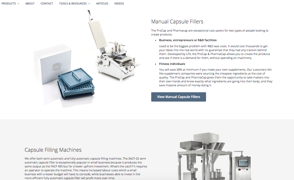
Now, simplicity may work for most businesses. Nonetheless, there are some niches where information is going to be your main selling point. This is the case with LFA Capsule Fillers, a company specializing in machines and equipment for creating supplement capsules.
Seeing that their products are highly specialized, and aimed at an expert audience, creating a homepage that relies on a few sentences or graphics would be impossible. At least not if they wanted to address all their customers. For this reason, the brand chose to show off the four main product categories on their home page, with a brief introduction to the uses and benefits of each product type. This way, they’re keeping the amount of content on their homepage to a minimum but are not missing out on sales due to insufficient information.
Tip #3: Use stunning visuals
One of the most important rules of web design is that visuals perform better than text. Just because of the speed at which our brains can process visual information, showing instead of telling will always be the absolute best strategy for directing a website visitor’s attention to a section of your homepage.
For example, if you take a look at the Adobe homepage, you’re likely to find that the elements that catch your eye are the images. You will only read the text once those have captured your attention.
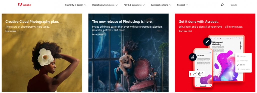
Of course, you don’t have to be an award-winning designer to be able to add a few products to your homepage. But, this is a good thing to remember, as every single product image you use will have an impact on your sales, conversions, and ultimately, brand awareness.
Tip #4: Let your visitors imagine themselves using your products
Other than emotional marketing, probably the most effective way to appeal to your customers is through predicting and answering their desires. And in a big way, this means working with their imagination.
One of the drivers of consumer desire includes comfort and knowing. Simply put, wanting to know what to expect is a basic human instinct. For some companies, playing to this need will include offering an extended warranty. For others, however, it will mean successfully managing expectations. A great example of just that comes from Mannequin Mall, a company that makes mannequins and dress forms for leading retail businesses in the US.
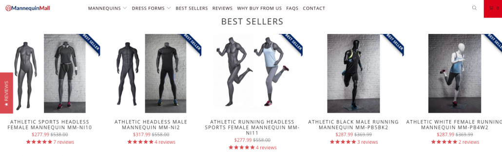
In showcasing products on their homepage, they’ve chosen to include images of those products being used as they would be by potential buyers. This way, website visitors don’t have to waste their time on imagining how the mannequins would look when in use, but can, instead, focus on imagining them in their sales space. And ultimately, this brings them further down the sales funnel, as they move straight onto the evaluation phase.
Tip #5: Don’t be afraid to go with what works
Here’s the thing: if you already have a product (or group of products) that perform exceptionally well, it’s likely because they’re great at answering consumer needs. And it’s a good idea to feature these bestsellers on your homepage.
The concept is nothing radical, yet it works for several reasons:
- A customer who sees the word “bestseller” is likely to associate it with higher quality.
- The idea that one product sells well also implies that previous customers have been satisfied with it.
- Choosing to showcase a select product on your homepage speaks of your belief in that product’s quality.
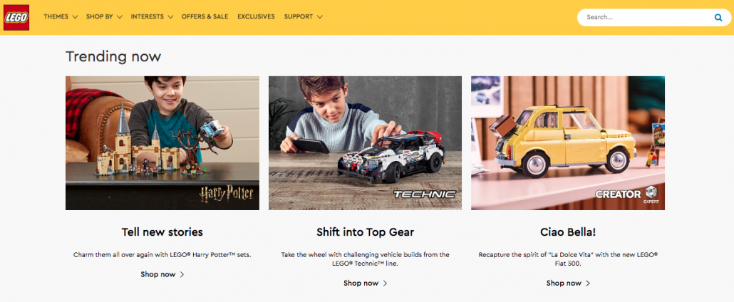
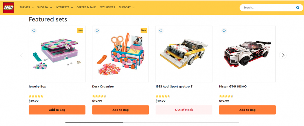
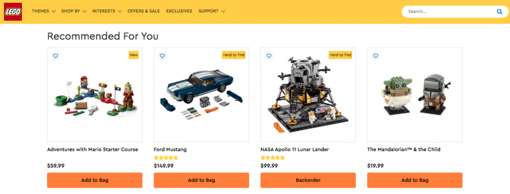
You don’t have to complicate things. Even if your e-commerce store is full of items, you can choose a few ones that perform well, and showcase them in a few different ways. Lego, for example, has three separate product sections on their homepage, including a Trending Now, Featured Sets, and Recommended for You section.
Tip #6: Call attention to special offers
Last but not least, remember the impact discounts can have on your e-commerce sales. And to ensure they stand out, make sure to point them out on your homepage.
It can be part of what you’re already doing with your featured or bestseller products, or it can be a separate section where you call attention to all the special offers you’re running at the moment.
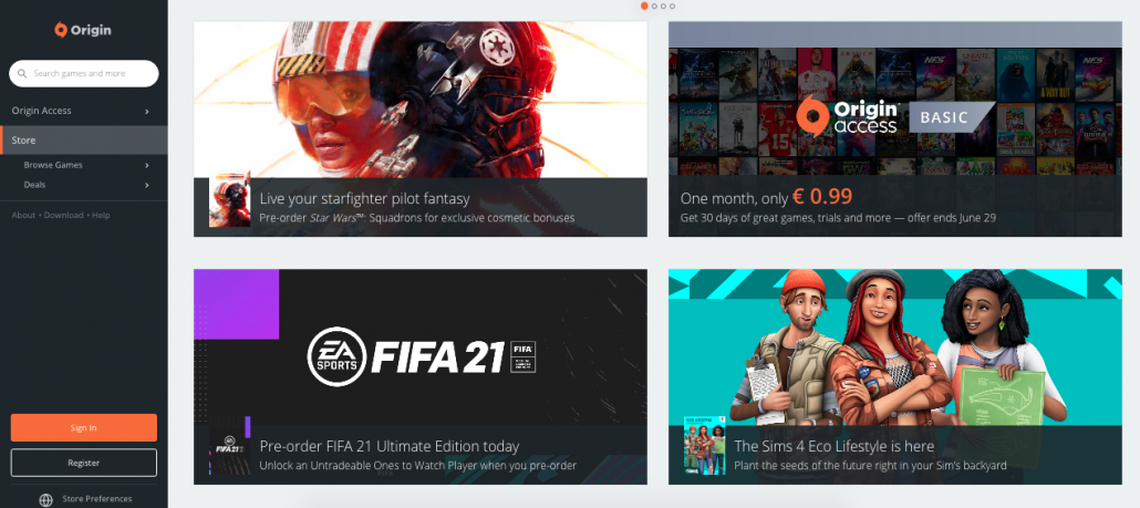
For example, the digital distribution platform Origin chose to feature four different special offer categories on their homepage. Two of the showcased products include games that are available for pre-order, one is the latest release on the platform, and the last square is dedicated to a limited offer for their subscription service.
Conclusion
There is no right or wrong way to showcase products on your homepage. You can allow website visitors to add items to their cart directly from the homepage, or you can feature select products and redirect those interested to the relevant page.
When deciding on the way to go about this task, remember to choose what works best for you. As your design is unique, you will want to go with practices that are consistent with it and that speak to your target audience. Whether you decide to follow one or all of the tips above is entirely up to you. Just make sure you’re making your choice because it works on your homepage, not because someone said it’s the “right way” of doing things.